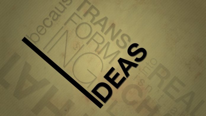
When was the last time you scrolled through your Facebook feed and a video with moving text caught your attention?
Media outlets, government agencies and corporate organisations across the world are all taking up kinetic typography to spread their message. It’s hard to argue with the appeal – if done properly, it’s striking, concise and easily digested.
Besides, who would want to read a long winded article for three main points that can be condensed into a minute long video?
Kinetic typography are most suited for advertisements, pushing a viewpoint, summarizing large amounts of data and presenting key takeaways from complex procedures and policy.
A soundtrack – usually an instrumental – is often added to the video, but they are almost a moot addition. The graphics alone should be strong enough to shoulder the video’s message. How else will you reach all those people watching on mute at work?
Here are some great examples;
http://www.businessinsider.com/avoid-these-bad-unprofessional-email-sign-offs-2016-12
https://www.youtube.com/watch?v=8fsH8qxDDY4
https://www.youtube.com/watch?v=8uT1xTLXSvA
To create a video with all the bells and whistles; Adobe Illustrator and Adobe After Effects are the go-to software. This will allow you to do zooming, blurring and other cool effects.
Adobe Photoshop, iMovie or SoundSlides can mimic them, but personally, I find that it takes considerably more effort. Instead, use Adobe Illustrator to come up with the images and use Adobe After Effects to put them into motion.
Before you get started, fully plan out and visualise what you want to say or do. It’s a pain to go back and change even one word, especially if you’re going to narrate.
Keep the text short and simple. Highlight the most important words or phrase you believe should be emphasized and use that for the video. Do not write long paragraphs.
Depending on which audio you decide to use (narration/music). Record the narration after you’re absolutely sure of the text you want to use. Then match the text animation to the narration. Same applies for music.
It is recommended that you prepare a storyboard for each text as that makes it easier for you to start animating your work.
You don’t have to be a graphic designer to be able to pull this off. You will need a few hours’ of free time, a lot of patience, a spark of creativity and a story worth telling.
And what better way to learn about kinetic typography than watching a video in that very format. Get started: https://www.youtube.com/watch?v=fOi5P1qxrM4


![[Video] The boutique airline to the world: Royal Brunei’s ambitious growth](https://www.bizbrunei.com/wp-content/uploads/2025/03/RB-Youtube-Thumbnail-100x70.jpg)
![[Video] The Airport Economist: Brunei Darussalam](https://www.bizbrunei.com/wp-content/uploads/2025/03/AE_Youtube-Thumbnail-100x70.jpg)
![[Video] Australia and Brunei strengthen ties through collaboration and shared vision](https://www.bizbrunei.com/wp-content/uploads/2025/03/AUS-Youtube-Thumbnail-100x70.jpg)


